

Watio Galego
Identity | Academic project
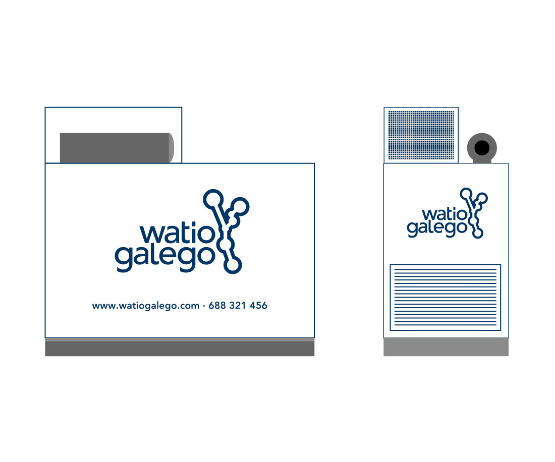
Corporate identity design and application to stationery and signage for a Galician company working on electrical installations, maintenance, equipment rental generators and lighting artist.
The graphic concept is based on the constellation of Taurus (which in times of classical Greece was that of Zeus, god of lightning) and the comparison between the artistic lighting and belts of stars.
Each dot represents a city of the seven most important in Galicia (Santiago, Coruña, Ourense, Vigo, Lugo, Pontevedra and Ferrol) which highlights the regional level on which the company operates.
The color blue represents the sky getting dark in contrast to the light.